You have spent hours perfecting an Instagram filter. The face tracking is smooth. The colors pop. The animation cycles like a dream. You publish it, wait for the impressions to roll in, and then… nothing. The problem might not be your filter. It might be the tiny square that represents it.
The thumbnail is the first thing people see when they scroll through the effects tray. It is your one chance to convince someone to tap that icon instead of the dozens of other filters vying for their attention. If your thumbnail looks blurry, boring, or confusing, nobody will ever discover the amazing AR experience you built. That is a hard truth, but it is also a fixable one.
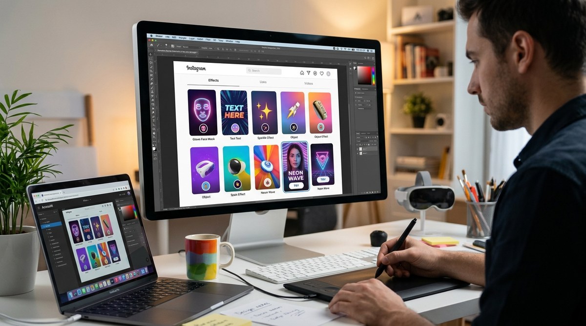
Instagram filter thumbnails are your most powerful tool for driving usage, yet most creators treat them as an afterthought. A great thumbnail communicates the filter’s effect instantly, looks crisp at small sizes, and triggers curiosity. By following the design principles in this guide, you can turn your thumbnail from a weak link into a conversion machine that gets your filters discovered and shared.
Why Your Thumbnail Matters More Than You Think
Instagram’s effects tray is crowded. Every creator, brand, and hobbyist is publishing filters daily. Most users scroll past thumbnails in under half a second. In that brief moment, your thumbnail has to answer three questions:
- What does this filter do to my face or surroundings?
- Will it make me look cool, funny, or interesting?
- Is it high quality enough to share with my friends?
If your thumbnail fails any of those tests, the swipe continues. The best filter in the world cannot save a bad thumbnail.
Think of your thumbnail as a movie poster. A movie poster does not show every scene. It sells the vibe, the genre, and the reason you should buy a ticket. Your thumbnail does the same thing for your AR effect.
The Anatomy of a Click-Worthy Thumbnail
Let me walk you through a repeatable process for designing Instagram filter thumbnails that people actually tap. This is the system that top AR creators use to get millions of impressions.
-
Start with a clear focal point. One person. One face. One moment. Do not try to show the filter from every angle. Pick the single most flattering or interesting frame and lead with that. If your filter adds floating sparkles, show a face with sparkles clearly visible. If it changes your background, show the environment transformation clearly.
-
Use a high quality source image. Never grab a blurry selfie from your camera roll. Shoot specifically for the thumbnail. Use good lighting. Make sure the person in the photo has a clear expression that matches the filter’s mood. Happy filters need smiling faces. Glam filters need confident poses. Goofy filters need exaggerated reactions.
-
Show the effect, not the interface. Your thumbnail should demonstrate what the filter does, not show the Instagram camera UI. Crop out buttons, text overlays, and the shutter icon. The viewer needs to imagine themselves using the filter, not staring at a screenshot of the app.
-
Keep it readable at small sizes. The effects tray shows thumbnails at roughly 120×120 pixels. Zoom out on your design. If you cannot read the details at that size, neither can your audience. Bold shapes, high contrast, and simple compositions work best.
-
Limit your color palette to three or fewer strong colors. Too many colors turn into visual noise at thumbnail scale. Pick colors that complement the filter’s aesthetic and make the subject pop. Warm tones like coral and gold tend to outperform cool tones for beauty filters. High saturation works well for fun and playful effects.
-
Add a subtle preview of movement if possible. Instagram thumbnails do not animate, but you can suggest motion. Hair blowing. Particles mid-air. A hand mid-gesture. These cues tell the brain that this filter does something dynamic.
Quick Design Principles to Follow Every Time
- Use front-facing, well-lit portraits whenever possible. People connect with faces.
- Center the subject. Thumbnails get cropped into circles in some parts of the Instagram UI.
- Avoid text in the thumbnail. It becomes unreadable at small sizes and clutters the image.
- Match the thumbnail style to the filter’s actual look. Clickbait thumbnails lead to disappointment and low retention.
- Export at the highest quality setting your editing software supports. Compression artifacts look unprofessional.
- Test your thumbnail on a phone screen before publishing. What looks good on a monitor often falls apart on mobile.
Common Thumbnail Mistakes and How to Fix Them
Let me show you what works and what does not with a side by side comparison.
| Mistake | Why It Hurts Usage | The Fix |
|---|---|---|
| Blurry or low resolution image | Looks amateur and untrustworthy | Shoot in good light with a recent phone camera |
| Showing the full camera UI | Confuses viewers about what the filter does | Crop tightly to show only the face and effect |
| Too many visual elements | Overwhelming at thumbnail size | Stick to one subject and one clear effect |
| Dark or low contrast scenes | Gets lost in the effects tray | Brighten the image and increase contrast |
| Text overlays that are too small | Unreadable and distracting | Remove text entirely or place it very intentionally |
| Thumbnail does not match the filter | Users feel tricked and swipe away | Capture the thumbnail directly from the filter preview |
“The best Instagram filter thumbnails look like they belong on a magazine cover, not like a random screenshot. If you cannot see exactly what the filter does in under one second, you have already lost the user.” – AR creator with 8 million collective filter impressions
Technical Specs That Actually Matter
Instagram does not publish strict thumbnail guidelines for creators, but real world testing reveals what works. Your thumbnail image should be at least 1080 x 1080 pixels for a square crop. This gives Instagram enough data to downscale cleanly. If you start with a smaller image, the platform stretches it and introduces blur.
Save your file as a PNG or a high quality JPEG. Avoid heavy compression. A thumbnail that looks pixelated signals low effort, and users will assume the filter itself is low quality.
When you upload through Meta Spark Studio or the Spark AR Hub, the platform asks for a thumbnail image. Upload your best version here. Do not let the platform auto-generate one from your filter preview. Auto-generated thumbnails rarely capture the most flattering moment.
Test Before You Publish
Before you hit submit, test your thumbnail in a realistic environment. Send it to your own phone. Open Instagram. Look at the effects tray. Does your thumbnail stand out from the filters around it? If it blends in, go back and increase contrast or brightness.
Ask a friend who does not know your filter to look at the thumbnail for two seconds and describe what the filter does. If they guess wrong, the thumbnail needs work.
Remember that Instagram displays thumbnails differently across devices. An iPhone 16 Pro Max shows more detail than an older Android phone. Design for the lowest common denominator so your thumbnail works for everyone.
Put It All Together
You would not launch a YouTube video without a custom thumbnail. You would not post a TikTok without a hook. Your Instagram filter deserves the same treatment. The gap between a filter that gets 100 uses and one that gets 100,000 uses is often just a better thumbnail.
Building an audience for your AR work takes time. Every thumbnail is a touchpoint. Every tap is a chance to show someone what you can create. Treat the thumbnail as part of the creative process, not a boring checkbox at the end.
If you want to read more about the full filter creation process, check out our guide on how to publish your first Instagram filter and get it approved fast. We also have a breakdown of what makes an Instagram filter go viral in 2026 that covers the bigger picture of filter strategy.
Your Next Step to Better Thumbnails
Open your camera roll right now. Find the filter you are most proud of. Look at the thumbnail you are currently using. Be honest with yourself. Would you tap that thumbnail if you saw it in the effects tray? If the answer is no, you know what to do.
Redesign that one thumbnail using the principles we covered. Shoot a fresh photo. Crop tightly. Boost the contrast. Show the effect clearly. Then publish the update and watch what happens to your usage numbers.
Sometimes the smallest change makes the biggest difference. Your filter deserves to be seen. Give it the thumbnail that gets it there.