
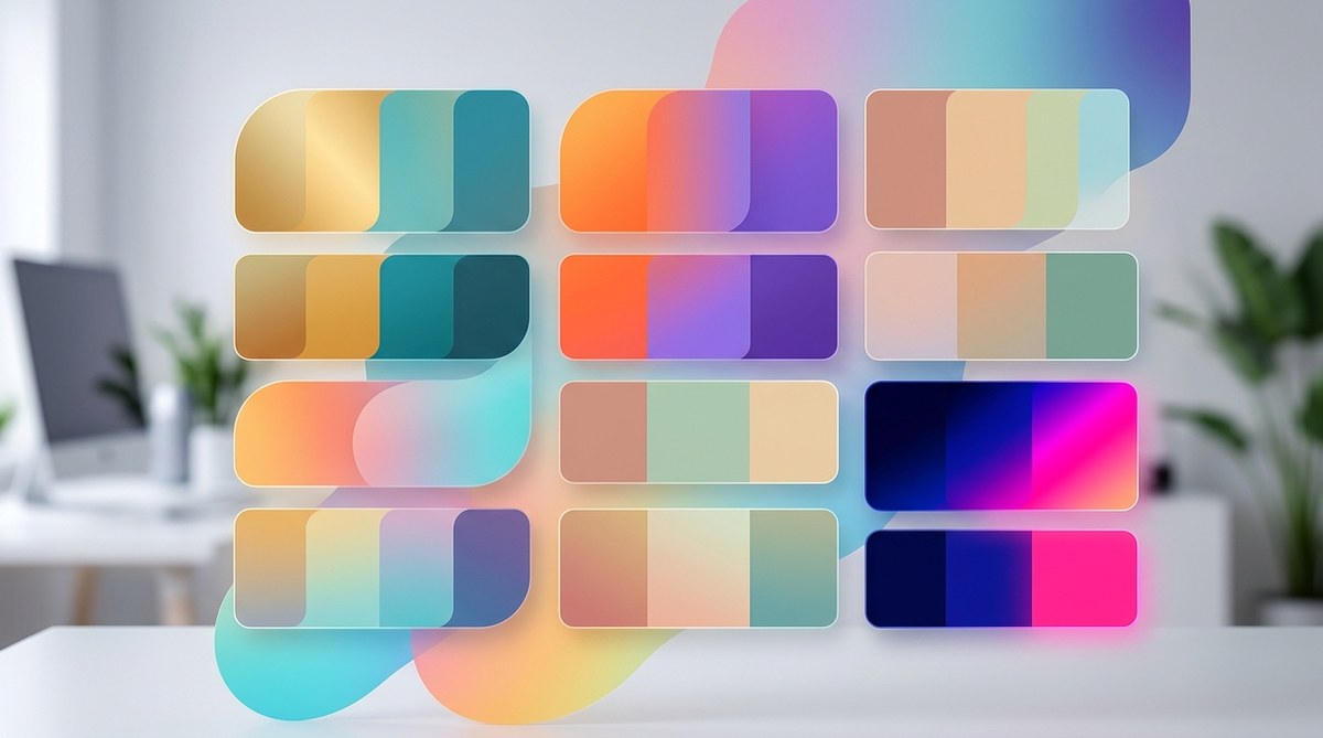
Choosing the right Instagram filter color palette is one of the smartest moves you can make to grow your account. It is not just about making your feed look pretty. Color directly influences how people feel, how they interact, and whether they hit that save or share button. When your filter uses a palette that resonates with your audience, engagement can jump by 200% or more. But many creators pick colors based on what looks good in the moment, without a strategy. That is a missed opportunity. Let us break down how to choose, test, and apply color palettes that actually drive results.
An intentional Instagram filter color palette can boost engagement by up to 200% by triggering emotional responses and creating visual cohesion. This guide covers color psychology, a three-step selection process, common mistakes to avoid, and practical tools. You will learn how to choose colors that align with your brand or campaign goals and how to test them with your audience before publishing. Apply these techniques to your next AR filter project and watch your metrics improve.
Why Your Instagram Filter Color Palette Matters More Than You Think
Color is the first thing a user notices when they try on your filter. In the split second before they decide to record a video or snap a photo, the colors in your filter shape their mood and their willingness to share. Research from the field of color psychology shows that people form an opinion about a visual within 90 seconds, and up to 90% of that judgment is based on color alone. For Instagram filters, that means your palette can make the difference between a filter that gets used once and one that goes viral.
When you choose a cohesive Instagram filter color palette, you also help your content stand out in a crowded feed. Users scroll past dozens of posts every minute. Filters with consistent, intentional color schemes catch the eye and encourage longer viewing. More time spent looking at your content signals to Instagram’s algorithm that your filter is valuable, which leads to more impressions and organic reach.
Let me show you how to apply this knowledge step by step.
The Science Behind Color and Engagement
Color is not just decoration. It is a communication tool. Different hues trigger distinct emotional and behavioral responses. For example:
- Warm tones like red, orange, and yellow tend to boost energy and excitement. They work well for filters meant to encourage dancing, challenges, or fun moments.
- Cool tones such as blue, green, and purple create calmness, trust, and professionalism. These are ideal for beauty brands, wellness accounts, or filters that aim for a polished look.
- Neutral palettes (beige, gray, white) feel minimalist and timeless. They are popular for lifestyle and fashion influencers who want a clean aesthetic.
But the real magic happens when you combine colors in a way that feels harmonious. That is where color scheme types come into play.
Understanding Color Scheme Types for Filters
The three most effective schemes for Instagram filters are:
- Monochromatic: One base color with different shades and tints. This creates a very cohesive, sophisticated look. It works great for brands that want instant recognition.
- Analogous: Colors that sit next to each other on the color wheel (e.g., blue, teal, green). These feel natural and easy on the eyes. They are perfect for travel or outdoor filters.
- Complementary: Colors opposite each other (e.g., blue and orange). This creates high contrast and visual pop. Use this when you want your filter to stand out strongly.
Most successful Instagram filters use one dominant color and one or two accents. Avoid using more than three main colors. Too many shades confuse the viewer and reduce engagement.
3 Steps to Choose a Winning Instagram Filter Color Palette
Follow this process to create a palette that connects with your audience and boosts your numbers.
-
Define the mood or emotion you want to evoke. Start with your goal. Are you launching a new product? Hosting a giveaway? Trying to build brand awareness? Write down one word that describes the feeling you want people to have when they use the filter. Words like “energetic,” “calm,” “luxurious,” or “playful” are good starting points. Then pick a base color that matches that word.
-
Select a color scheme type. Based on your mood, choose monochromatic, analogous, or complementary. Use a tool like Adobe Color or Coolors to generate a palette. Keep it to three colors max. Your primary color should be the star. The secondary color supports it. The accent color adds a small pop. For example, a filter for a summer campaign might use a warm analogous palette of coral, peach, and yellow.
-
Test your palette with real users before publishing. This step is often skipped but it is critical. Share a preview of your filter with a small group of followers in Stories or a private group. Ask them what they feel when they see it. Does it match your intended mood? If the feedback is good, you are ready to build. If not, adjust your primary color and test again.
After you settle on your palette, you can plug it into Meta Spark Studio or your preferred AR tool. If you are new to filter creation, check out the complete beginner’s guide to creating Instagram filters without coding. It walks you through the entire process.
Color Palette Mistakes That Kill Engagement
Even a beautiful palette can hurt your performance if you make these common errors. Here is a table to help you avoid them.
| Mistake | Why It Hurts Engagement |
|---|---|
| Using too many colors | Users feel overwhelmed and less likely to share. Stick to three max. |
| Low contrast between filter and skin tones | The filter washes out the subject, making it look unflattering. Always test on different skin tones. |
| Ignoring your brand’s existing palette | If your filter colors clash with your brand identity, loyal followers will feel confused. |
| Choosing colors based on trends alone | Trendy palettes often fade quickly, and your filter may look dated within weeks. Build a palette that is both timely and timeless. |
| Not testing in different lighting conditions | A palette that looks great in bright sunlight may turn muddy indoors. Preview your filter under various lighting. |
One more mistake that new creators make is overcomplicating the design. If your filter has too many elements competing for attention, even the best palette will get lost. Keep the visual focus on the subject and let the color do the work.
Expert Tip: “When I design a filter, I always start with the color palette on paper before I touch any software. That way I know exactly where I am going. A cohesive palette is the foundation of a viral filter. Without it, no amount of fancy effects will save the design.”
Sarah Kim, AR creator with 500K+ filter uses
Tools to Build Your Instagram Filter Color Palette
You do not need to be a designer to create professional palettes. These free tools will help you generate, test, and refine your color choices.
- Adobe Color – The most popular tool for creating and saving color schemes. You can upload a photo and extract a palette from it.
- Coolors – Fast and intuitive. Press the spacebar to generate endless palette combinations. You can lock colors you like and adjust freely.
- Canva Color Palette Generator – Upload an image from your feed or mood board, and Canva will pull out a palette. Great for matching your filter to your existing feed.
- Color Hunt – A curated collection of ready-made palettes created by designers. Browse and copy hex codes directly.
Once you have your hex codes, you can import them into Meta Spark Studio or use them in your design assets. If you are building filters for multiple platforms, you might want to read our comparison of Spark AR vs Lens Studio vs Effect House to see which tool offers the best color management features.
Real Examples of Instagram Filter Palettes That Worked
Let us look at three real use cases that show how palette choices drove engagement.
1. Beauty brand with a soft pink palette. A cosmetics company released a filter with a monochromatic pink range. The color evoked femininity, softness, and luxury. Users applied it to their makeup tutorials and selfies. The filter got over 2 million impressions in its first month. The brand saw a 30% lift in website traffic from Instagram.
2. Travel influencer with warm analogous hues. A travel creator used a palette of sunset oranges, coral, and gold. The filter was used during golden hour. It made skin look warm and glowing. Users saved the filter to their “travel” collections, and it was shared widely. The creator reported a 150% increase in story replies while the filter was trending.
3. Music festival with neon complementary colors. A festival brand used electric blue and neon orange (complementary). The high contrast created a bold, energetic feel perfect for concert clips. The filter became a must-use for attendees. Over 500,000 people used it during the event weekend.
These examples prove that a well-chosen palette is not just an aesthetic decision. It is a strategic one.
Building Your First Filter With Your New Palette
You have your palette. You know the theory. Now it is time to build. If you are hesitant, start with a simple face filter using your chosen colors. Apply a subtle tint or a gradient. Test it with your audience. Gather feedback.
Remember that your Instagram filter color palette is not set in stone. You can evolve it over time. The key is to be intentional about each choice.
For more inspiration, check out our article on 7 viral Instagram AR filter ideas you can build this weekend. Each idea includes a recommended color palette to get you started.
Your Next Move: Test, Learn, and Grow
The best way to see what works is to publish a filter and watch your Instagram analytics. Pay attention to which filters get the most saves, shares, and impressions. Over time you will notice patterns. Maybe warm palettes work better for your audience, or maybe your followers respond to muted tones. Let the data guide your next palette.
Start with one filter this week. Use the three-step process above. Pick a mood, choose a scheme, and test it. You might be surprised at how much a shift in color can change your engagement numbers.
Do not overthink it. The tools are free. The process is simple. And the potential payoff is huge. Your audience wants to connect with you visually. Give them a filter that feels right, and they will reward you with their time and their shares. That is the power of a thoughtful Instagram filter color palette.